BRIGHTEDGE
Platform Theme
REDESIGN
Project Description
BrightEdge is the first SEO platform to deliver proven ROI - enabling marketers to increase revenue from organic search in a measurable and predictable way
The BrightEdge platform currently has a theme with a fixed width of 950 pixels. The company is considering a redesign of the platform to use a flexible width theme instead.
My task is to (One Week Time):
- Identify the pros and cons between fixed width and flexible-width (or fluid or responsive design)
- Re-design (i.e. create mockups) of the page provided using a flexible width arrangement for various screen sizes
- Provide your reasoning for the layout and design changes and describe the important interaction details for the design
Fixed Width vs. Responsive Design
Fixed Width
Pros:
-Appear the same design across all devices.
-Easier to give people instructions about how to use your site since everyone will see the same content in the same places.
Con:
-It may be hard to read and navigate on a small device, which will require a lot of pan and zoom.
Responsive Design
Pros:
-Automatically adjust and size images for the device being used to view the website. Even resizing a browser window will result in an immediate and smooth adjustment of the site.
Con:
-Site graphics and layout may change or be removed once the site shrinks for a smaller view. While full-size websites are easily customizable, usually the smaller responsive versions don’t have as many features.
Conclusion
Since people nowadays use different devices with varied screen sizes to surf the internet, it’s important to provide a great user experience no matter what device a user is working with.
Thus, Responsive Design would be the best solution!
Current Website Analysis
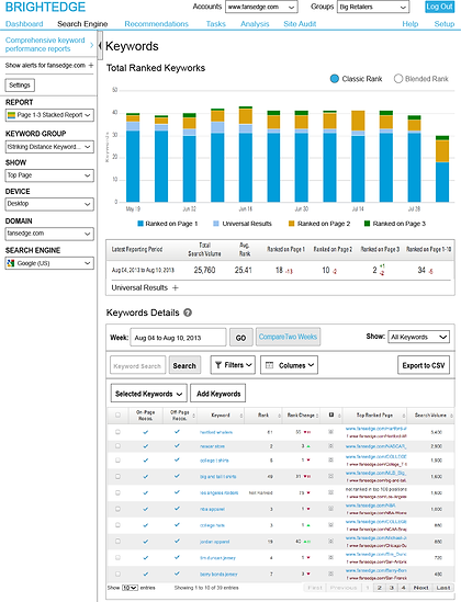
This page is a detailed keyword report:
-The bar chart is a visual representation of the amount of keywords that are ranking on a weekly basis for a given keyword group.
-The table right below the bar chart has detailed data of the last week presented in the bar chart.
-The table below shows the list of the keywords in the keyword group tracked on this report. From here, users can track the performance of each keyword in relationship with the page that is ranking in a given Search Engine.

Journey Map
1.Check Total Ranked Keywords
2.Check Lastest Report
3.Find a specific Keyword
4.Change to another account
5.Find another keyword
6.Change Search Engine and Device
-scroll down
-type the word into “Keyword Search”
-hit Enter or G
-scroll up to top
-click on Account to choose
-scroll down
-type the word into “Keyword Search”
-hit Enter or Go
-scroll up to top
-go to Comprehensive...
-change
Thought:
Eextra steps(in red) can be saved by providing a floating head bar and a side bar containing all parameters.
Mobile/Content First
-It ‘s always easier to start simple and gradually add more functions than decrease elements from an already complicated structure
-It helps to define what is the most important part out of all functions
Methods:
-In this case, since I need to redesign an existing platform, I started by defining the most essential elements
-Adapting functions from desktop to small mobile screen that is also touch-friendly
Wireframe of Extra Small Devices (phones, less than 768 px)
Quite a few features and datas shown in desktop version are hiden by default, which will allow faster webpage loading speed.
Head bar always float on top for faster access to menu
Parameters are hide inside because frequent users can understand what’s going on and don’t need to check it until they need to change/check data under different parameters. On the other hand, first time users do will `receive a brief guidance going through this part.
Big, more touch friendly buttons replacing original ones shown on desktop version
These two drop down window define how keywords are listed below
unfold and show all details on this keyword
This is currently a popular way of showing menu and other information. Since Facebook, Youtube and other websites use this method., people will adapt to it very fast if users have already had the experience of using services mentioned above.
This gives users a convenient approach if they want to visit full site on their mobile device or in a shrinked size of browser window.
There should also be an option to come back to mobile version.
The whole page slide to left, revealing a new page containing all Settings elements about Keyword Details
Wireframe of Small devices (tablets, horizontal, 768px and up)
Head bar always float on top for faster access to menu
Parameters are seperated into three columns, this can change to two columns if viewed on a tablet with smaller viewport
Rearranged buttons to adapt to tablet screen size
Wireframe of Desktop (992px and up)
Header and side bar always float at current position for efficient navigation
Click to fold/unfold side bar
Current Website
Rearranged layout takes less space
New Version
Listing these elements in a side bar allows faster access when a user have scrolled down to Keywords Details sections
Every single element can be accessed righ away
Visual Design
Colors
All colors come frome Brightedge.com in order to create a similiar feeling, allowing users quickly to adapt to changes
Mobile Version
Compared to current white nav-bar, blue color make it visually more easier to differenciate it from content below
Dark blue represents its importance, which is parameters affecting the all information shown on page
Taller but thinner ratio of bars make it more easier to see the fluctuation of data on small screens
Desktop Version
THANK YOU FOR WATCHING!
You might also be interested:


